Responsive Navigation: Optimizing for Touch Across Devices
Designing towards touch really forces us to simplify and decide what’s most important- what needs to stay on the screen. If we go through that exercise we ultimately end up with software that’s easier to understand and as a result more often used. Both good things. And while big touch targets can be comfortably used with a mouse (in fact they’ll be easier to hit with a mouse), small mouse size targets can’t be used easily with touch. So when in doubt, optimizing for touch will make sure things are usable for both mouse and touch users.
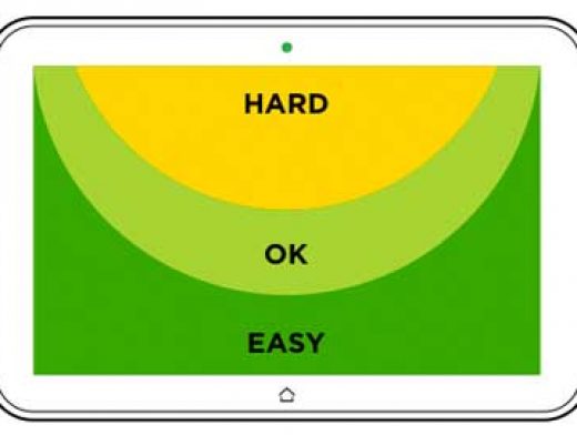
But accounting for touch isn’t just about the size of controls, the placement of controls is important as well. To understand why this matters, let’s look at how people hold a smartphone. In each of these examples, the bias is toward right handed use as most people in the world are right handed.
