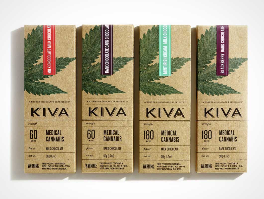
Finally, marijuana packaging that doesn’t look like it was designed by a stoned teenager
Speaking at Design Observer’s Taste symposium in Los Angeles, California earlier this month, Sharp explained how important it was to make the bar’s medicinal content as clear as possible. With the bluntness of a drug label, delivered with the finesse of a graphic designer’s trained eye, Sharp (who collaborated with designer Jaime Lee) created a package to help guide Kiva’s customers who may be new to cannabis edibles. He made sure that the potency of the candy bar’s tetrahydrocannabinol (THC) content was clearly marked in front of the box.